Five visualization patterns I keep reaching for
After a decade of building viz systems, these five idioms cover most of what I do.
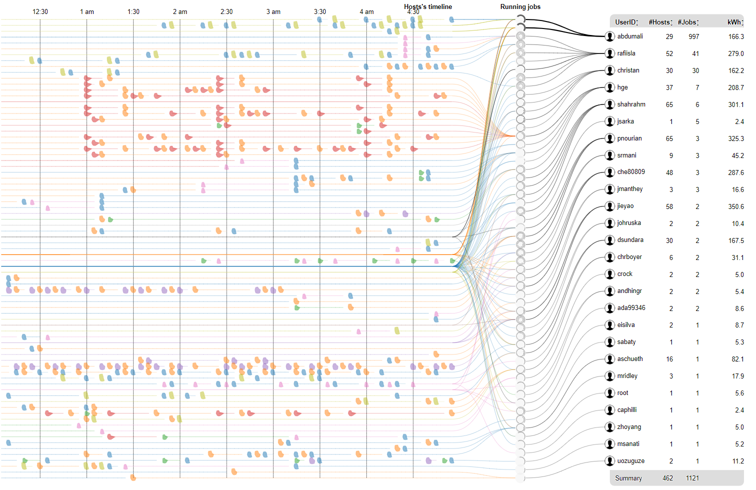
Across a decade of visualization research — from EEG signals to HPC telemetry to financial news — I keep reaching for the same handful of visual idioms. They are not the flashiest, but they are the ones that reliably turn a confused stakeholder into someone who can see their data. Here are five, with where each one earns its keep.
1 · Small multiples
When you have many series and one question — how do these compare? — nothing beats a grid of identical little charts. The eye does the comparison for free because every panel shares a scale. I reach for this before any clever single-view encoding.
2 · The radial timeline
Cyclic or evolving structure — communities, schedules, seasons — often reads better wrapped into a ring than stretched along a line. This is the idiom behind TimeRadar: time as angle, magnitude as radius.
3 · The connected scatter
Two variables over time, drawn as a path rather than two separate lines. Loops, reversals, and dead-ends in the trajectory tell a story that two time-series charts hide.
4 · The saliency overlay
When a model makes a decision, paint its reasoning back onto the input. This is the core move in VixLSTM — and it generalizes far beyond neural nets, to any pipeline whose intermediate weights you can recover.
5 · The humble sorted bar
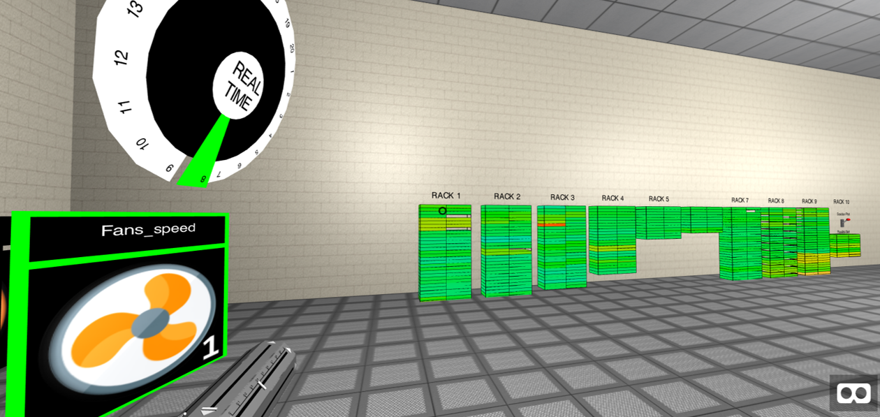
And after all the radial layouts and 3D rooms, the chart I trust most for a final answer is still a bar chart with the bars sorted. Sorting is the cheapest, most underused interaction in visualization.
Reach for the simplest idiom that answers the question. Save the spectacle for when the data truly earns it.